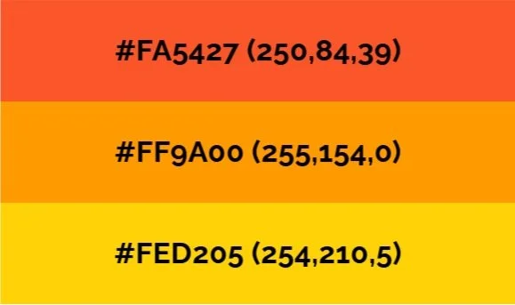
Vibrant colors
We have chosen orange as our primary color scheme, due to its strong resonance with:
Innovation & creativity
Passion & energy
Service & support
An icon in sign language history
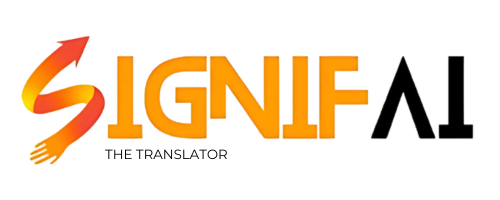
Detail lies at the heart of The SignifAI Translator’s logo.

At first glance, the graphic resembles the letter “S” – the initial for SignifAI – coated in a dynamic gradient of orange. As we look closely, the rightmost end of the design has an arrow-like design, emblematic of the universal translation icon. The leftmost end depicts the silhouette of a hand, representative of the sign language community.
All in all, our icon illustrates the principles of what SignifAI stands for: a sign language translator that steers innovation.
Text logo
We also designed a complementary text logo to accompany the icon, aligning with modern branding practices. Its sleek, futuristic font reflects our vision of pioneering innovation.